

The Clarinet District Shot 1: Maya Render

The Clarinet District Shot 1: Basic Composite

The Clarinet District Shot 2: Maya Render

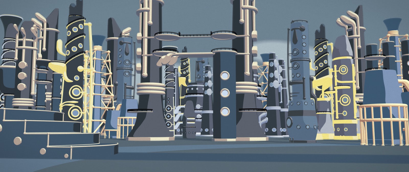
A start to texturing the Clarinet District. There's still some tweaking to be done. The yellows are possibly too bright and some detail needs to be added to the door / wall. The door itself could be coloured (exposing the details). It's possibly a bit too 'gloomy' overall as well.
Yes, the yellow looks a bit sickly doesn't it - maybe consider using the same recipe as you've got going on the 'scaffold' tower, where the scaffold has that grey/creamier tones - so dropping the big yellow areas in favour of that approach? Though, all of that said, I do like the thin yellow highlights on that middle tower - maybe that yellow could be saved for the rims of the windows - just as little accents on the various buildings to add interest, and use the 'cream' colour for the chunkier more solid elements that meet the floor? All of that said, this is looking pretty much like the Clarinet District to me!
ReplyDeleteIn terms of the sky, maybe we can lift the greyness a little, using the soft powder blues as opposed to the metal-ly greys, and may consider using the yellow for some of the 'pathways' on the ground plane - that will cheer things up no doubt!
ReplyDelete