Monday 25 July 2016

YPGTTO: Pre production - shapes, silhouettes and shadows... and outlines too

As me and Jordan kick start the pre production phase, the first thing I wanted to do was to explore some non standard ways of creating and rendering 3D objects.

For this post I am focusing on just a few techniques, which by themselves don't amount to much, but my hope is that you can see their potential. Over the coming weeks I aim to expand on what I'm showing today as well as covering all the nitty gritty details.

For now though, I will keep all technical jargon to a minimum!


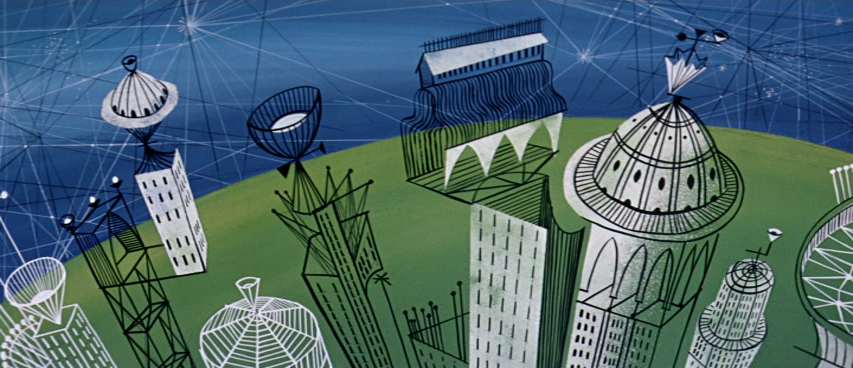
For my first test I have taken some design cues from Julien Van Wallendail's bold response of the harp district in order to experiment with shadow casting and negative space.


I really like the idea of revealing hidden 3D forms or finding alternative ways to represent a 3D object. This is a theme that runs throughout this post. This was my response:


Notice how the two hidden ribbons (between the long black lines) receive the shadows cast by the hidden pillars; but when the camera views the scene from the other side, you can see that the ribbons are completely transparent. The pillars are only made visible by revealing the pink backdrop.

I didn't spend any more time taking this test further though. It was my second test piece where I spent most of my time experimenting!


It was based on the idea of creating simple architectural shapes that are made from block colours and outlines. More specifically, I wanted to make the construction of these shapes appear multi layered and disconnected; taking cues from the following artwork:


I intended to create a simple tower as the basis for my test. ( although for some reason, whenever I look at it now I think of lipstick instead! )


And here is my first test piece using several pre rendered elements of the tower:


Things to note:
We can only ever see the front facing side of the wireframe.

When we erase some of the block colour, it's not simply being made transparent, it's actually masking out what is behind it.

The outlines don't appear to be drawn directly on the mesh, but instead drawn over the mesh. ( a small but subtle difference! )

We have lots of control over the final look in After Effects because all the components are rendered separately.

Of course, you might be thinking that this is going to add some complexity to the pipeline, and you may be right. However, I think I need to create a more complete test - with multiple shapes, foreground / background elements, multiple colours etc, just to see what it could look like, and to see if there is some way to simplify the whole process... it's not really that difficult once you know the steps involved.

Here is another test using the same pre rendered components, but I have mixed things up a bit in After Effects:


Theoretically, we could layer more blocks of colour, and or hand paint outlines on the mesh, and still treat them as separate layered components. ( although I want to experiment with this further to see how far we can push it without it getting unnecessarily complicated )

We could use fully textured and or shaded shapes instead of block colours.

We could have a model that is partially represented as a wireframe, and partially as a solid. ( and paint exactly where we want to blend between the two or mix them - and even animate it )


At the end of the day, we're probably going to use many different techniques, as long we keep some visual consistently throughout the animation.


One final test to show is this outline shadow, which I thought looked quite effective when combined with a solid object:


OK, so lots to think about... and even more things to experiment with.
What do people think of these ideas?

Ethan Shilling

Saturday 23 July 2016

YPGTTO: Preproduction Test #01 - Simplicity and Restriction

As preproduction ramps up, myself and Ethan are exploring art direction, animation and technical aspects with an open mind. It's the exciting stage whereby we try lots of things out, throw things at the wall, and see what sticks. And so to kick things off, here is the first of many tests and experiments in that vein.


Inspired CAA student, Julien Van Wallendael's beautiful response to the harp district, this is all made in Maya, with Hardware 2.0 rendering and super simple geometric construction.


It's been a while since I've used Maya, so this first experiment is an exercise in simplicity. I wanted to create an engaging and creative environment using a simplified toolset within Maya. These restrictions were as follows:
  • Hardware 2.0 rendering as a base, super responsive and  speedy output.
  • No texturing, only shaders. 
  • No lighting
  • Simple Models / Multiple Layers
This already starts to explore some ideas which we have discussed as a team in early meetings. Can we simplify Maya as a toolbox for creating exciting environments that are expressive and engaging, but also easy and fun to build? And can we do this with an emphasis on animation. I.e the art direction and creation should be of the animated world, rather than competing with the real.

These are all really appealing notions. Especially for independent animators of student film makers. Often, the complexities and possibility space of Maya can destroy a project. Users get so flustered and caught up with what Maya can do, that they simply forget about what it should do. This points to the idea that we create a restricted Maya toolset for our modelling team that allows for creativity but suppresses over-the-top, technical creations. Essentially, giving more time to the things that are most important, like storytelling, or animation, or art direction.

Here are a few screenshots of exactly what this scene looks like in Maya. It's rendered in Hardware 2.0, so a full 30 second shot only takes a minute or two to generate via playblasts. The shaders are largely surface shaders, so create a bold base without the need for lighting. And the modelling is so simple that it invites creativity. It allows for the user to play around, try things out, throw them away. Without that horrible feeling that you just spent 20 hours on a particle system that looks like crap.


It only took an evening to create, render and composite this scene. And although this is in no way a definitive guide to how things will look or how we will move forward, it does bring up some exciting possibilities. The simplicity of this approach is very refreshing. It would allow modellers to spend time on the sets themselves. Allowing them to be creative and unrestrained. And it would allow for other departments to expand.

In my next few experiments, I'll be looking at particles, textures and shaders. I'd like to explore the possibilities of shaders as an addition to the toolset. Almost like a set of paints, can we create off the shelf textures that the art team could use for city generation. And can they express the print like qualities shown within Julian's work?

In addition, I'll be posting a few discussions on art direction and approaches to CG production. But for now, this starts to get the ball rolling. More soon!