Showing posts with label concept art. Show all posts

Sunday, 25 June 2017

YPGTTO - The Joy Of Collaboration

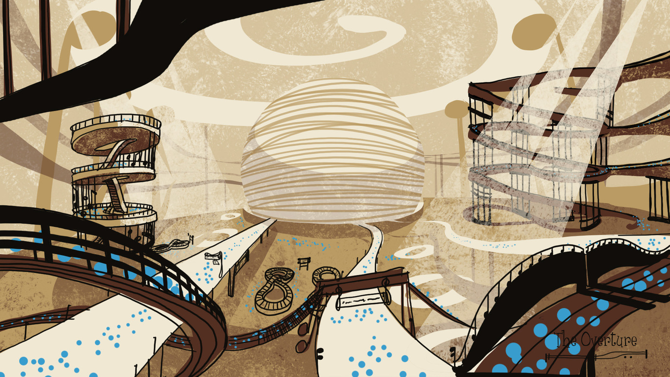
Just wanted to share this recap of some of the creative goings-on here on planet YPGTTO in celebration of the joys of collaboration. The scale and ambition of producing seventeen minutes of animation to accompany live performances of Benjamin Britten's The Young Person's Guide To The Orchestra demands we collaborate effectively.  The visualisation and realisation of The Overture - the first of our animation's fantastical environments - has seen graduates collaborating with current students, and current students with staff - with exciting results!

YPGTTO aka Red & The Kingdom Of Sound  / The Overture / Concept painting by Emily Clarkson

YPGTTO aka Red & The Kingdom Of Sound  / The Overture / Digital set modelled by Samantha Niemczyk & Deanna Crisbacher

YPGTTO aka Red & The Kingdom Of Sound  / The Overture / Digital set textured, lit and composited by Alan Postings

YPGTTO aka Red & The Kingdom Of Sound  / The Overture / Digital set textured, lit and composited by Alan Postings

Thursday, 15 June 2017

Environment/ Asset Design- Lots of Signage!

Embarking on some of the last few pieces of District furniture. I needed to finish the signs preceding a few of the Districts.

Following Red's fall down the stairs to the Double-Bass District, he scrambled to his feet and is faced with Design number 2

Chosen Design 2


Later, after his ascent from the Double Bass District, Red finds himself on the precipice of the Harp District. A few lovely little birds fly by, carrying Signage Design 1 to inform him of his place in the world.

Chosen Design 1
 Directly behind Red is the Horn District. The squiggly spaghetti like structure of design number 5 will be the Horn District Sign he will see. Shortly afterward, he sets off with steely resolve to find the summoning light in the distance.

Chosen Design 5


A while later Red finds himself caught up in a stampede of fellow notes as they all speed towards the summoning light in the distance. It puts both Red and the Trumpet District sign in a bit of a spin!

The design was supposed to point in the direction of the district. The first sheet of designs I focused on creating it entirely from Trumpet elements. However they didn't communicate direction very well at all. So in sheet two I took a more obvious approach and we settled on design number 5.


Chosen Design 5

Finally the Percussion District. Red arrives in spectacular fashion, delivered by the hook of a crane to find himself in the middle of a Construction site. 

The Percussion section is comprised of multiple instruments, unlike the others. Initial sign designs were therefore a mix of instruments. As I struggled to nail it down, it was highlighted that I had missed the most obvious connection. Triangles are well known for warning and caution signs, so that was the instrument I then fixed on to complete the Percussion District signage.



Thursday, 8 June 2017

Environment/ Asset Design- The Overture- Maps and Departure Boards

Some rather major furniture missing from the Overture are the departure boards and the map of the Kingdom of Sound. Inspired by Jordan's original storyboard sketches I came up with 2 designs. of departure board.

Design 1 I applied a gentle wave to the sign and used the staves as our information boxes. Inspired by current railway station live updating signs, I saw the status of the trains as messages that scroll across the rows from right to left, updating passengers.

Meanwhile design 2 was based on Jordan's idea. The staves again operate as information boxes, but instead of an alternating LED display, the labels sit on a rotating barrel that flip round. Instead of letter by letter rotation I went for entire names and phrases. And the board as a whole takes the shape of a scroll.


Jordan Buckner's Departure Board Storyboard sketch


The other sign in need of investigating was the area map. Phil sent me some ideas for designs in which the map sat atop a cone of musical notes, which is the dominating design on page 1. I then experimented with other methods on page 2, utilising ceiling fixings as well as a column idea.
We decided on a ceiling mounted sign, investigating a mixture of thumbnails 4 and 5.


The chosen designs are below. (Number 2 of the area maps) The music notes were removed from both designs, opting for simpler and sleeker staves for design aesthetic. On the departure board the column titles were deemed unnecessary and also removed.


Environment/ Asset Design- Percussion District- Cranes and Final Machines

The Percussion District is a working construction site. we needed the presence of some familiar machinery. In this case, a crane to help fill the night skyline.  Design 1 is the likely candidate.


More recently we have consolidated the series of hammers needed for the Xylophone Conveyor Belt scene down to three designs. Here are the orthographies for the Beaters, Cymbals and Mallets.


Environment/Asset Design- Double Bass District- Cables and Turbines

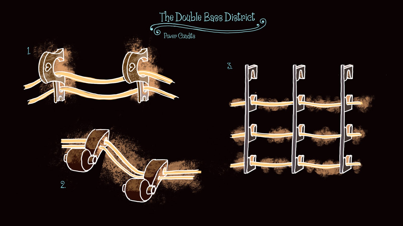
The Double- Bass district was in need of some filling out. Though not too much. The district is a cavernous subterranean power station of sorts. The Double-Bass strings operate like power cables, lighting up when vibrating, but they had to attach to the floor somehow. So here are some ideas for structures anchoring them to the floor and walls.

The multi- levels of thumbnail 5 have been chosen as the main base styles.


Secondly I embraced the concept of some Double- Bass Turbines. These machines will each dwarf Red in the huge space.


Friday, 19 May 2017

Environment/Asset Design- Percussion District- Plot based Assets

More recently I have been tasked to create specific story elements as Red makes his way through the rather perilous percussion district.

Red's entry to the district is quite the terrifying scenic route as he's brought in caught on the end of a crane hook. Number 5 is the chosen hook style.


After landing on a girder Red finds himself dodging a swinging wrecking ball made to look like the end of a beater/drumstick. The chosen shape was 4 but needs modifying to have a more substantial cable than the feigned Piano wire I was going for.


After unsuccessfully dodging the wrecking ball Red is propelled into a new scene, landing dazed on a girder suspended rather precariously high up. I investigated different Percussion instrument formations. Including Glockenspiel Keys, Piano Keys and Xylophone keys. They need to be suspended by a single cable however to allow for Reds slapstick sliding off one end.


Here is the collection of smaller assets with modifications. The girder on a single suspension cable. The wrecking ball is now sitting on a musical note inspired chain (The little sketch to the side of the wrecking ball is what the single unit looks like)


The construction yard as a whole is a bit of a gauntlet. There is a conveyer belt on which Red finds himself dodging a sequence of Percussive hammers.  Below are some examples.


Environment/Asset Design- The Bassoon District- Signage and Doors

A while ago I created some Bassoon signage. The wall mounted version 3 seems to be the way to go. 

I also, more recently, explored the 'Ominous Door' Red goes through to arrive at the Bassoon District. There are so many lovely valves and shapes on the bassoon, they really lent themselves to giant ornate doors you'd expect in a more fantasy setting. 

1 was a large single door. 2 was a symmetrical gate and 3 was an asymmetrical gate, with a smaller door on the right side.


Friday, 12 May 2017

Environment/Asset Design- The King's Palanquin

In the race to the summoning light, Red finds himself head-to-head with the King of the Trombone and Tuba District. Of course royalty won't be seen running and the King gives chase in his Royal Palanquin! Here is the design process and the characters to scale. Design no.3 was the chosen model.


Palanquin Orthographics

The Palanquin to scale!

Monday, 1 May 2017

Environment/Asset Design- The Cello District- Signage


A few Cello signage designs. Red will swim into the district from quite high up, so the initial signs were little too short in stature. Number 7 of the taller set is the finalised design.


Saturday, 22 April 2017

Environment/Asset Design- The Violin District- Carriage's and Caboose

Here are the orthographies for the Carriage designs, both interior and exterior

Below are designs for the Caboose that comes at the end of the train. Design 6 was the preference so I went ahead and created the orthographics for that as well. 


Character Design- The Horse

Helping with the load, I have taken Julien. V. W's original concepts of the horse notation character and helped finalise the designs into orthographies.


Thursday, 20 April 2017

Environment/Asset Design - Violin Trains and Carriages

Red makes his way through the Violin District by train, so aside from the Engine there also ended to be carriages. Below are some of the initial interiors. And the development of Interior 1, showing both the interior and exterior. 

The scene in which Red finds himself aboard is slightly abstracted, and the carriage 'draws' itself into existence, so below we have the purely outlined version followed by the full colour version as the train pulls away. 


Friday, 14 April 2017

Environment/Asset Design- Violin District/ Clarinet District- Signage and Trains

I've been creating a few more assets. mainly signage for each district, below we have some for the industrious Clarinet District. below that some signs for the Violin district. Finally i have been revisiting the Violin Trains based on the previous feedback. I tried out another colour palette for it as well.