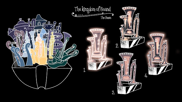
The districts also need to glow, which I am currently struggling to convey using the UPA style. It may be a case of breaking out of the traditional drawing style and literally applying a glow effect- Let me know what you think.
On the left was my first attempt at adding all the districts together on one small land. The four images are samples of the Tuba and Trombone district. Thumbnail 1 I applied a glow to only the white outlines. Thumbnail 4 I applied the glow to the colour fill of the Tuba. I personally prefer the artificial glow of 1 and the colour fill of 4.
I'm going to try creating another collection of districts by using crystal formations as reference for more interesting layouts, like some of these samples below I've pulled from google. But instead of a rocky base I think I will create alternating levels like 'the Giants Causeway' in the orchestra footprint shape.
Crystal Reference imagery
The Giants Causeway Reference Imagery


I like glow 1 too - and the 'causeway' layering is a great idea :)
ReplyDeletesaw this, thought of you, Emily : https://upload.wikimedia.org/wikipedia/commons/2/2f/Bloemencorso_zundert_helptelkander_2008.jpg
ReplyDelete